Compound Branding
Compound Branding
Brand Design
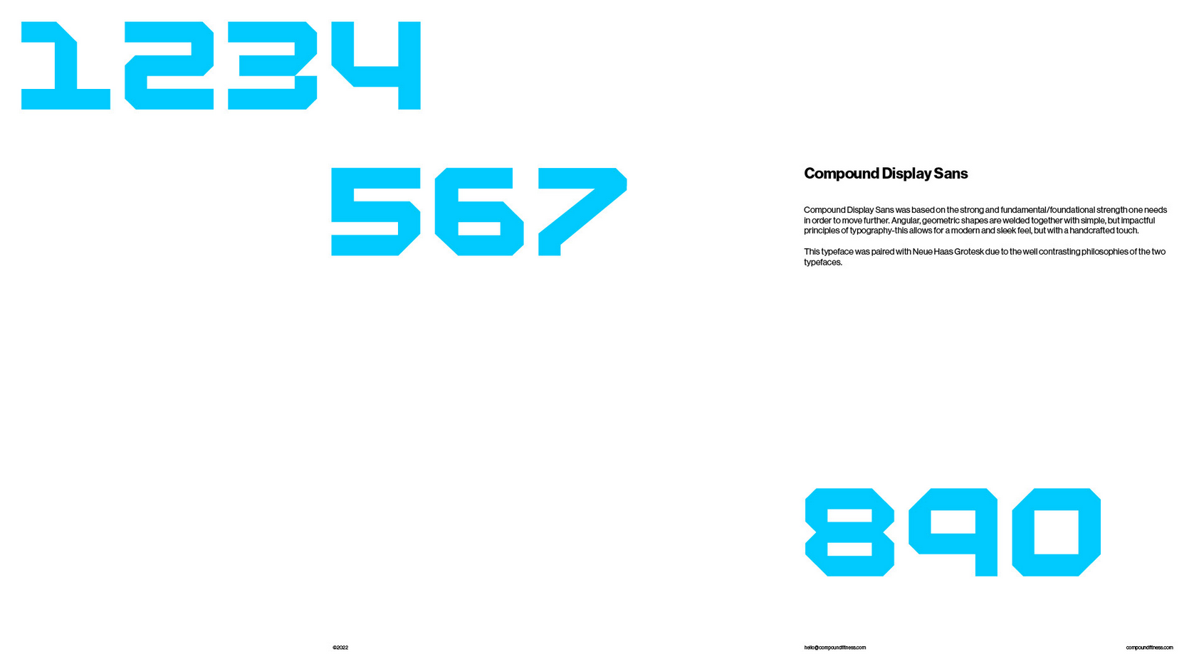
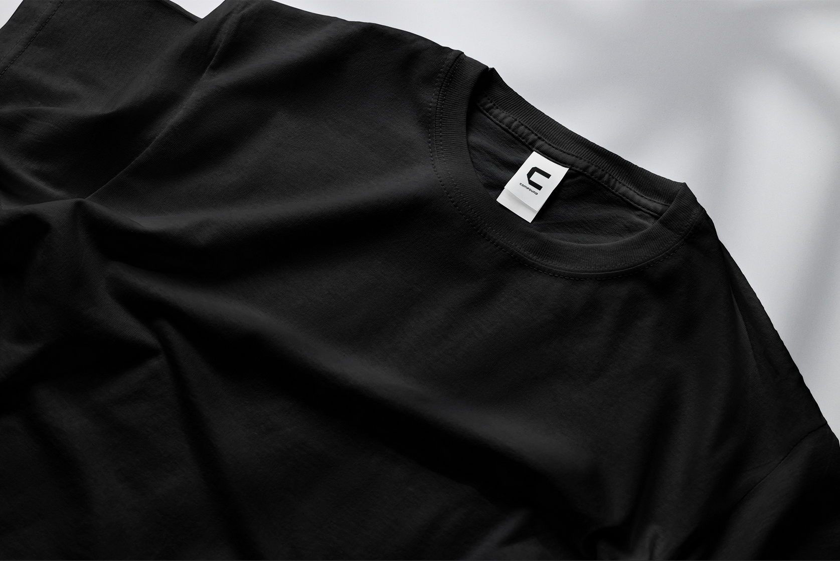
Compound is a straight forward, helpful, and simple approach to lifting weights and tracking your progress. Their target audience is the type of people who don’t like other apps that are alledgeldy supposed to do the same thing, but are cluttered with misinformation and bad design that makes tracking workouts complicated and a pain to deal with. With a visual approach to Compound’s brand idenity that was reflective of an ideally straigtht forward experience at each touch point a customer would come across, they are now equipped to be compared to their competetiors and come out on top. A simple logotype was created that could also be utilizied as a symbol by pulling out the first letter in compound. This logotype is sturdy, angular, and apart of a greater, more responsive brand structure. The name also speaks to the importance of obtaining a really solid foundation for your lifting career’s longevity by calling back to compound exercises- a mainstay in any bodybuilders exercise routine.